Monday, February 20, 2012

Something quite different...cocktails!

After a successful celebrations of my girlfriends birthday just this weekend i thought i might as well post a few of the quirky illustrations i did for her, her party theme was cocktails - so i offered to paint up a few cocktail recipes for her friends to mix.
All in all there's around 14-15 drinks, i had to duplicate some because and focus on adding the cocktails "identity" in some made up logos (text mixed with quick color/illu ideas). Its nothing fancy but she liked 'em and i thought it was hella fun to try and do :).

I wonder if a book would be cool...hmmm


Here's an overview of the drinks.
All of the pieces had the ingredients in front, my gf's party logo thing and a description on how to produce the said cocktail.


just had to do this one :P


Tuesday, January 31, 2012

Doombible

I've recently stumbled across an old document created for doom, before it was made into what we all remember.
Apperently it was to be set on a planet called Tei Tenga and the project was largely revamped shortly after the document was finished (it might have been too grand for Id software at the time)...although little of Tei tenga remains in Doom, i did find some interesting descriptions for the hangar level (was called Hangar two in the document.)

#Excerpt

"BUILDING DESCRIPTIONS
Hangar Two
The secondary hangar fell into disuse after the glamour faded from the Tei Tenga bases. It now stores used up equipment, junk, and the room where the soldiers play cards. Sunk into wall of canyon. You can see out a window on the second floor.
The hangar has become grungy since it has fallen into disuse.
Graphic Description: Hangar is UAC style. However, since it has fallen into disuse, it is slightly shabbed-out UAC, with the occasional dripline of oil or rust. Not everything is perfectly ordered. Stains on floor of hangar.
Basement

Large Storage Area: a lot of stuff on palettes. Storage canisters.
...
Hangar Bay: Huge room, with the odd crate. On floor huge 2's and track for landing
ship. Crane above. Crane operator booth opposite doors. It may be possible to open the doors after the power is turned on. Two big elevator platforms can lower to basement if power is on.
Main Exit: Leads on a path to Supply Depot Two.
Equipment Room: Locked up Forklift thing, Storage stuff.
Depot Office: Official and messy looking room.
Break Room: Messy, microwave, cabinets, tables, Rollee chairs. Toilets: Stalls have swinging doors (to show that off)
Elevator: to second and basement floors.

Second Floor
Hangar Control Room: where they meet to play cards. Large crate surrounded by
small crates. Cards drawn on top of crate. In this room there should be 4-minus-the- number-of-players bodies on the floor. Can have personal palettes corresponding to who isn't playing. Map on wall with flashing problem areas. Should be at end of hallway, so demons are on your way out. Player starts here.
Offices: your basic futuristic offices. Desk, screen on wall, cabinets.
Toilets: need to figure out a generic toilet area to paste everywhere.
Equipment Room: one of the first place to get items.
Communications Room: Neat-o computers set into wall. One extruded control desk. Elevator. Goes between three floors. Should have up and down and number indicators,

maybe a place for lights to go by like in Star Trek.
Crane Operation: View window out toward crane. Extruded control desk.
Window in hallway: you can see out onto the surface, and the sky. Perhaps a here."

Will try and see if i can't try and budge this in to the idea of the level....i'm beginning to sway in favor of expanding a bit on the Tei tenga stuff, sounds like a much more well-thought through area.

Monday, January 30, 2012

Exit please?

Here's my take on the exit door.


The exit door in the orginal doom is one of those hallmark designs that, bar that you've played doom ofcourse, you'll recognize anywhere.
It has a distinct H.R Giger'ish feel to it.
It, quite rightly so i suppose, stands out from everything else pretty much in the entire game.
This was sort of in doom 3 changed to an elevator or the airlock (which granted was quite cool actually :)).

I've tried to hit something in-between'ish and like with the rest of the door designs it had to fit an overall style (where the round iconic cables didn't really fit well with) - i've tried to remedy the missing cables with a strict set of tubes...i think i'll try and hint at it being an exit without resorting to a sign as in the below screenshot :P.


Sunday, January 29, 2012

awww...

Here's the wip design for my version of the doom zombie/former human.
My general thoughts or backstory for this guy is that much in the same way that the zsec in doom3 was taken over by lost souls, so were these guys.
Their skin and body size have been drastically reduced (too look like they've been drained of any life.)
This is still very much work in progress though, but i wanted to share the design early on.

Major poop edit: i just fucking realized this looks close to rage's mutants...
Well...back to the drawing board i guess :(


Friday, January 27, 2012

Quick update before heading to bed - got to import the SU model and i've cut the model, have yet to set up UVs though too...trying to get as much of the modelling done right now.
On a side note this guy is probably gonna end up around this tris count (is that bad i wonder :S)
Either way, will try to cut it down atleast 800-1000 tris' (if i can :P)


There's really no beating around the bushes - just finished the medium door...in sketchup... (original texture was called something mediocre like door2_3...meh, so long interesting names right :P.

I think its futile to try and take the whole original design 100% as it was in the classic doom game, there's no denying that the game was a mishmash of styles thrown in together (the UAC bases never really looked like 'real' space stations or whatever they were). Obviously the tech played a keen role in how the art had to be portrayed (no room on top of another mmmhh!), and with every new doom game there's been (doom 64/Doom 3/Doom II rpg) the art and style has changed.
So i'm trying to stay within the "pay tribute, but not copying 1-1 the designs" ballpark...the door designs are gonna still feel clunky, spacey but also a bit oldschool i'm hoping.


Doom door, its a wee one!

Done-so...or well not even close - here's seperated model, i didnt actually have to clean the mesh up that much after my sketchup import - tried to export via .obj which obviously resulted in one mesh, but it was far less of a hassle to detach things than check for double vertices everywhere :S.


I briefly started setting up the uv map, but i figured it'd be stupid to waste all of the extra tris' on the mesh, so i might but combine them all and cut out/connect the pieces (saves me a bunch of texture space probably too...)


Wednesday, January 25, 2012

Fuck leotards!

Mo'ar stuff for my side-project...i've been studying quite alot of doom stuff lately, being that the project here kinda requires it.
I'm confused and bewildered with Doom, atleast the classic version...its a jumbled mess of styles slammed together in a non-cohesive way almost.

Trying to remedy this by taking something like the doors and giving them a unified looks, there's going to regardless be some nods to the original classic designs, and i'm finding it really hard to come up with an iconic design for the exit door.
Yet thats probably because in my mind, the exit door for doom can't look like just any door, the original design had a taste of giger'ish in it even.

Oh well i'll trod on, on a side note too i've mocked up the entire E1M1 level ('cept for secret areas) - and i'm having a REALLY hard time not just re-imagining the different areas...breaking a promise to myself here...this all just started with me wanting a new pistol, a new imp, zombie and a few touched up textures (help me please!!!).


Variations on the floor texture in E1M1, not really happy with the old one...sheesh, looks like something outta castle wolfenstein (but i didn't want to neglect nostalgia either).


Variation of the Starg3 texture (if you dont know what that is, then i can tell you it's the very first wall texture you see in Doom)


My pistol model, still lots of work to be done, but this is a nice resolution so far, im not planning on going higher poly than this because i want to keep the close-to-low poly-look.


Thursday, January 12, 2012

Did a quick sketch for the doom pistol design, my thinking is that its pretty close the blade runner blaster - as the doom 3 one was - the classic doom pistol was hugely inspired by the Beretta 92fs pistol, but i wanted something that looks a tad chunkier.

On to the modelling soon.....ish :P


Tuesday, January 10, 2012

Bored much?

Did a logo test for remake of the original doom, using handpainted textures and 3d models....dunno why i would seriously harm my brain with a project like that :S

Tech thingy texture is from the original DooM logo done by Don Ivan Punchatz (hope i got it right).
Next up is a couple of textures and an imp+zombie+gun and shotgun...i'm only gonne try and recreate E1M1 (too big a scope otherwise....small chunks!)


Saturday, December 03, 2011

Deadlock Modular building #2

Another modular building for the guys at Zero Point Software, this one has a few more concrete elements though :).

Monday, September 26, 2011

ITO Modular Building

A little design, among others that i've been working on for 'Interstellar Marines'.
It's basically a set of modular elements, so its been a hassle to come up both with a method to have almost all the pieces seamlessly attach to eachother, but i think the result is well worth it.
Photoshop cs 5 and Sketchup used on this one, the fake GI is actually a real render, kinda cheating but whatever gets the job done the fastest way possible right? :)

Tuesday, June 28, 2011

Project that never was

 Battlescape
 Zoomed in BS with grid
 3D terrain example
 Geoscape
Basebuilding interface

A long time ago, must be about a year ago or more, i started doing the early mockups for the game, i realize the im probably never gonna finish this thing - because A: im shit at 3d, and B: it takes a WHOLE lot of work to just finish a mod in time, let alone a whole game.

Though back when i did these i thought, i just need proof-of-concept to get this off the ground, alas not even that far did this thing get to before i lost interest.
I actually had an old colleague work on this with me (programmer) but we lost touch and well - its not the first failed game project on the web, and it sure wont be the last.

So im posting the screens here just so they dont rot on my HDD :P

A little about the game,

It sorted started out as a genuine attempt to just bring an old classic up to date, the idea was to create basically an HD version of X-COM.
It then progressed to the point where i was convinced that THIS is the next thing for people, even after the announcement of the new x.com (fps game afaik) people still cry out for a genuine follow up to the 1993 game - which essentially was 3 games in one.
My idea then was to take the old game and build on top of it, not to change anything, but to widen its scope - add more objectives, update its style (3d but low poly and using pixel art-like textures).

And furthermore i wanted to add a whole new basebuilding part, gone would be the top-down view and just setting up bland bases.
Nope, now the player would be in the drivers seat of how the base really looked - main inspiration came from tycoon games such as hospital tycoon and theme hospital, where the player engages in gameplay where you're supposed to build facilities to accomodate different objectives.
This would add a whole new dimension on top of the strategy, you would gain insight into what your alien containment really looked like - essentially adding more micro-management to a game already full of it (granted it would be lessened in some areas).

I also had an idea of merging the 'terror from the deep' games with UFO, essentially granting gameplay possibilites on both land and underwater which could've been quite cool i think.

....dammit i still want to finish this though! :S

EDIT: found some more old sketches


Monday, May 23, 2011

Friday, May 06, 2011

Grøn Koncert / Green Concert Tshirt Designs


Did these for a competition recently held for an annual danish (predominantly rock)-concert.
I was hugely inspired by the old "merrie melodies" cartoons from the 1930's and McBess' style.

The idea was to hit an image or design that could cater to a wide audience (ages 10-90 are actually attending the concerts).
The early sketches materialized into the (somewhat) final designs, where i only got to color the 1st and send it off, i deemed the trees, and so did my peers, that it probably catered to a more narrow audience.
Albeit it was the most fun to work on :).
Also because of the age span, i wasn't comfortable with showing beverages in an image and showing (even if it was trees) characters having a 'good' time.

Here's a few progress shots of the colored final design.

Tuesday, March 22, 2011

This just looks terrible

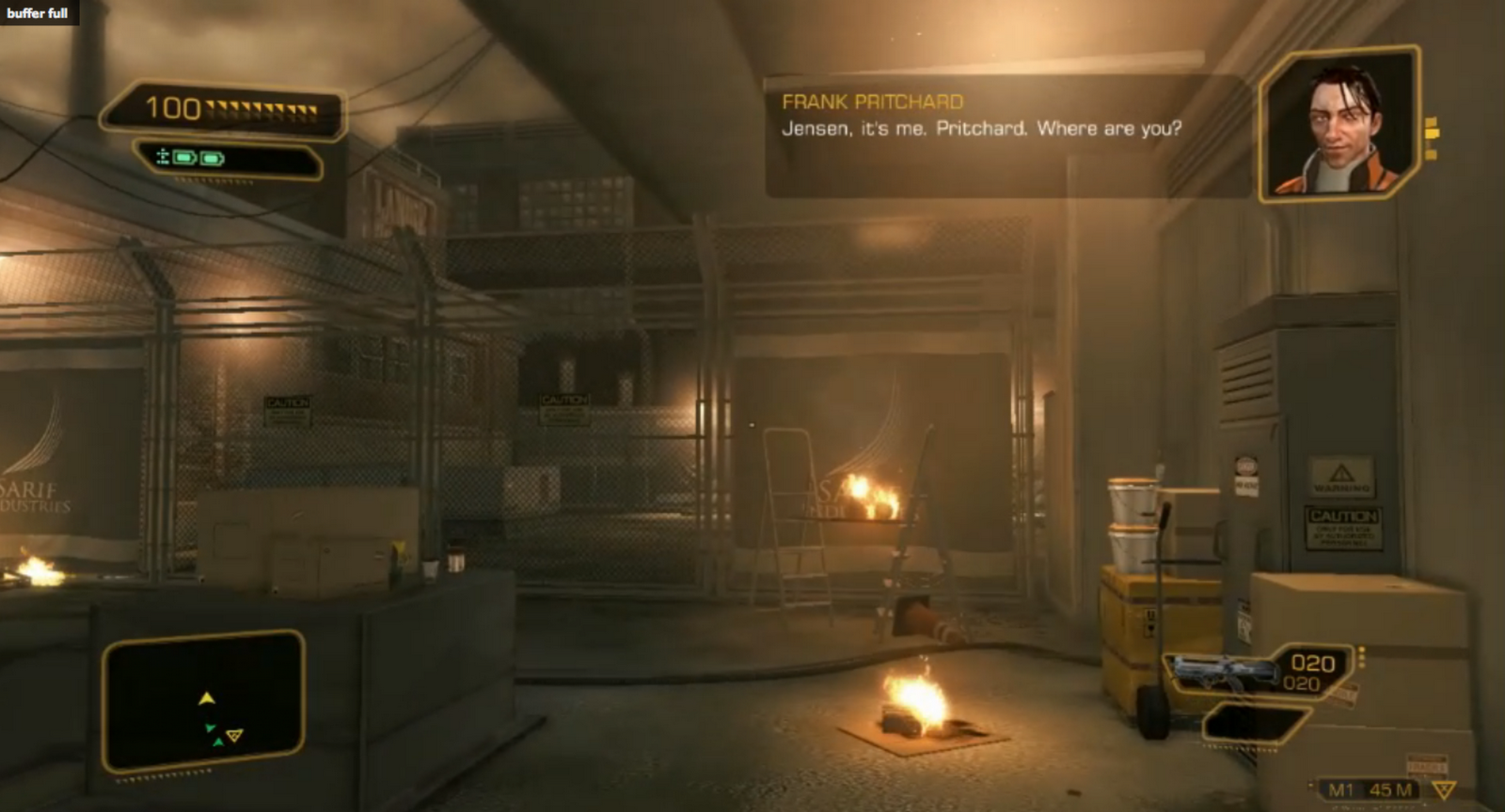
//So a new Deus Ex demo video aired tonight - and i think its the 1st time i (atleast) got a good look at the game's heads up display.
In short i personally think the hud is clearly lacking still (kudos though to the fact that the decs are bringing back the inventory).
Seriously though, the HUD graphics could've been ALOT tighter, now i was a huge fan of the Assassin's Creed hud which brought together the style of the ANIMUS and kept a firm grasp on the player.
Deus Ex does nothing new here, it seems the devs have gone with a complete lifeless hud that does nothing to pull the player into the world.
Communication between the player and for example the NPC in the top corner is SO sterile and unstylish that it borders on the cringeworthy as far as visual design goes.
The map also has nothing at all going for it - the information icons are forgettable, there's no level map even and a viewing cone would be nice.

Again the hud falls short, because its design (black and yellow with soft corners) have been done a MILLION times, i would've really loved to see a hud mimick the sarif industries stuff, makes us feel like we're really an advanced bio-enhanced super agent - the hud so far looks as if it was design for use on touch screens at the airport.

A HUGE question still remains, before we see the game shipped, will it get proximity and detection feedback, right now when you're discovered by enemy npcs you don't have any feedback like in Crysis or other FPS games that has a sneaking element, nor does it have visual feedback for showing the player if he/she is in shadows/hiding.

Generally its just sloppy 'consoly' design and i hope it gets way better once we're closer to August//


I did a quick mockup of my own then to see if i could spice up the HUD, this took 30 minutes or so, so its rough.
Notice even the small things as instead of spelling out the player 'PICKED UP 1 story piece' element or 'PICKED UP XX amount of ammo' i stayed within an 'hacking' sort of style, where words get shortened  or presented in a UNIX looking command line.


I didnt bother setting up a 'real' additive layer with the hud elements but i think it gets the point across.


And here's the heads up displays gathered from the original and sequel.

Deus Ex original


Deus Ex 2

Friday, March 04, 2011

University project - A bicycle design based on a function in nature


Function here was taking the strength and structure of trees and working it into a useable concept and design.
The 3D print was made by MOEF.dk

Thursday, July 22, 2010

No good at pixelart


i'm not any good at pixel art. or animation, but that can't hold back experiments :)

Wednesday, July 21, 2010

I'm a fan of K-NAUT


Here's a fun mockup for trudi :D, hope you feel better....and now here's a K-Naut game mockup for ya! :P

Tuesday, April 13, 2010

Helping the mod community


Decided to go back to my roots and help out some mods, stumbled across a SW mod for freelancer which i'm lending a hand - did a few quick logo treatments for them. these are all based on episodes 5-6 movie logo's.