Another modular building for the guys at Zero Point Software, this one has a few more concrete elements though :).
Saturday, December 03, 2011
Monday, September 26, 2011
ITO Modular Building
A little design, among others that i've been working on for 'Interstellar Marines'.
It's basically a set of modular elements, so its been a hassle to come up both with a method to have almost all the pieces seamlessly attach to eachother, but i think the result is well worth it.
Photoshop cs 5 and Sketchup used on this one, the fake GI is actually a real render, kinda cheating but whatever gets the job done the fastest way possible right? :)
Tuesday, June 28, 2011
Project that never was
Battlescape
Zoomed in BS with grid
3D terrain example
Geoscape
Basebuilding interface
Though back when i did these i thought, i just need proof-of-concept to get this off the ground, alas not even that far did this thing get to before i lost interest.
I actually had an old colleague work on this with me (programmer) but we lost touch and well - its not the first failed game project on the web, and it sure wont be the last.
So im posting the screens here just so they dont rot on my HDD :P
A little about the game,
It sorted started out as a genuine attempt to just bring an old classic up to date, the idea was to create basically an HD version of X-COM.
It then progressed to the point where i was convinced that THIS is the next thing for people, even after the announcement of the new x.com (fps game afaik) people still cry out for a genuine follow up to the 1993 game - which essentially was 3 games in one.
My idea then was to take the old game and build on top of it, not to change anything, but to widen its scope - add more objectives, update its style (3d but low poly and using pixel art-like textures).
And furthermore i wanted to add a whole new basebuilding part, gone would be the top-down view and just setting up bland bases.
Nope, now the player would be in the drivers seat of how the base really looked - main inspiration came from tycoon games such as hospital tycoon and theme hospital, where the player engages in gameplay where you're supposed to build facilities to accomodate different objectives.
This would add a whole new dimension on top of the strategy, you would gain insight into what your alien containment really looked like - essentially adding more micro-management to a game already full of it (granted it would be lessened in some areas).
I also had an idea of merging the 'terror from the deep' games with UFO, essentially granting gameplay possibilites on both land and underwater which could've been quite cool i think.
....dammit i still want to finish this though! :S
EDIT: found some more old sketches
Monday, May 23, 2011
Friday, May 06, 2011
Grøn Koncert / Green Concert Tshirt Designs
Did these for a competition recently held for an annual danish (predominantly rock)-concert.
I was hugely inspired by the old "merrie melodies" cartoons from the 1930's and McBess' style.
The idea was to hit an image or design that could cater to a wide audience (ages 10-90 are actually attending the concerts).
The early sketches materialized into the (somewhat) final designs, where i only got to color the 1st and send it off, i deemed the trees, and so did my peers, that it probably catered to a more narrow audience.
Albeit it was the most fun to work on :).
Also because of the age span, i wasn't comfortable with showing beverages in an image and showing (even if it was trees) characters having a 'good' time.
Here's a few progress shots of the colored final design.
Tuesday, March 22, 2011
This just looks terrible
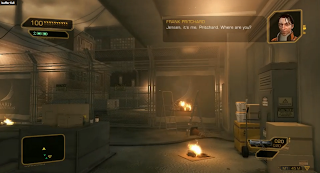
//So a new Deus Ex demo video aired tonight - and i think its the 1st time i (atleast) got a good look at the game's heads up display.
In short i personally think the hud is clearly lacking still (kudos though to the fact that the decs are bringing back the inventory).
Seriously though, the HUD graphics could've been ALOT tighter, now i was a huge fan of the Assassin's Creed hud which brought together the style of the ANIMUS and kept a firm grasp on the player.
Deus Ex does nothing new here, it seems the devs have gone with a complete lifeless hud that does nothing to pull the player into the world.
Communication between the player and for example the NPC in the top corner is SO sterile and unstylish that it borders on the cringeworthy as far as visual design goes.
The map also has nothing at all going for it - the information icons are forgettable, there's no level map even and a viewing cone would be nice.
Again the hud falls short, because its design (black and yellow with soft corners) have been done a MILLION times, i would've really loved to see a hud mimick the sarif industries stuff, makes us feel like we're really an advanced bio-enhanced super agent - the hud so far looks as if it was design for use on touch screens at the airport.
A HUGE question still remains, before we see the game shipped, will it get proximity and detection feedback, right now when you're discovered by enemy npcs you don't have any feedback like in Crysis or other FPS games that has a sneaking element, nor does it have visual feedback for showing the player if he/she is in shadows/hiding.
Generally its just sloppy 'consoly' design and i hope it gets way better once we're closer to August//
I did a quick mockup of my own then to see if i could spice up the HUD, this took 30 minutes or so, so its rough.
Notice even the small things as instead of spelling out the player 'PICKED UP 1 story piece' element or 'PICKED UP XX amount of ammo' i stayed within an 'hacking' sort of style, where words get shortened or presented in a UNIX looking command line.
I didnt bother setting up a 'real' additive layer with the hud elements but i think it gets the point across.
And here's the heads up displays gathered from the original and sequel.
Deus Ex original
Deus Ex 2
Friday, March 04, 2011
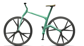
University project - A bicycle design based on a function in nature
Function here was taking the strength and structure of trees and working it into a useable concept and design.
The 3D print was made by MOEF.dk
Subscribe to:
Comments (Atom)


