Saturday, December 15, 2012

Basement Blockout

I decided to join the PC contest for 3d n00bs - still consider myself one when it comes to 3d and workflow in maya.

Hoping this'll help me kick off some bad habits in when modelling (number one MUST be procrastination XD)


first texture for the environment...still got some tweaks left tho.


Friday, November 16, 2012

The legend

I made a blog that followed my 10 week university game project :D

Apologies if you checked my blog and thought i was dead...i'm not, just busy :P


Thursday, August 23, 2012

Working on a piece which is part tribute, part for myself and GF, and lastly part trying to break away from my usual style.

The original is 9000something x 6000something pixels (in 300 dpi) since i'm hoping to print this at poster size and then framing it for the living room.
This is pretty much the first thing i've ever done for myself, and with the intention of hanging it up on the wall for all to see :S.


Monday, July 30, 2012

Sheep herding

Few sketches for a new piece i'm working on, hopefully it'll turn out to show a few "sad" robots in somewhat familiar but occasionally forgotten roles.

What i've come up for now is a the below sketch for an "ordinary" sheep herding robot (hey thats still an actual job in some countries) :).
This is all heavily influenced by gregory crewdsons photographs showing "ordinary people" in weird noir-esque scenes.

The rest of the scenes im thinking about at the moment is; 1) butcher bot. 2) mail office bot. 3) Street food maker bot. 4) taxi bot. 5) shoe cleaner bot.
I realize there's a jump from sheep herding to taxi's so im not quite sure if i should keep it all together...hmm


Wednesday, July 25, 2012

Guerilla Art Test

In 2010 i got invited down to Guerilla games (makers of the killzone franchise) for an on-site interview.
I had 2 amazing days in Amsterdam, everyone was extremely kind but alas long story short it didn't quite pan out at it should have.

Recently i found my Art test i did for them, back in late 2009 (submitted before christmas i think).
I can't quite remember the exact brief, but it was to create a more conservative helghastian civilian car (nuttin' like the banged-up ones you see throughout the games).

Pistolas

Bunch of semi-old pistol sketches (better than not posting anything at all right? - i will soon though)


Saturday, July 21, 2012

More old stuff...

Old, borrowed, cancelled stuff :)


These were all for an entry i made for the "samsung" competition last year, my dream gadget...just hoping wacom is already moving on this :P


Friday, July 20, 2012

Dead...core?

Perusing my old stuff, i came across a bunch of studies i did late 2009 - all built meticulously in sketchup - i think i must've gone insane and hidden this thing deep in the darkest parts of my mind :S

I can't really recall what the direct inspiration for the look of it was, but it sure does carry on a kind of deadspace-ish feel to it...


Wednesday, May 16, 2012

Monday, February 20, 2012

Something quite different...cocktails!

After a successful celebrations of my girlfriends birthday just this weekend i thought i might as well post a few of the quirky illustrations i did for her, her party theme was cocktails - so i offered to paint up a few cocktail recipes for her friends to mix.
All in all there's around 14-15 drinks, i had to duplicate some because and focus on adding the cocktails "identity" in some made up logos (text mixed with quick color/illu ideas). Its nothing fancy but she liked 'em and i thought it was hella fun to try and do :).

I wonder if a book would be cool...hmmm


Here's an overview of the drinks.
All of the pieces had the ingredients in front, my gf's party logo thing and a description on how to produce the said cocktail.


just had to do this one :P


Tuesday, January 31, 2012

Doombible

I've recently stumbled across an old document created for doom, before it was made into what we all remember.
Apperently it was to be set on a planet called Tei Tenga and the project was largely revamped shortly after the document was finished (it might have been too grand for Id software at the time)...although little of Tei tenga remains in Doom, i did find some interesting descriptions for the hangar level (was called Hangar two in the document.)

#Excerpt

"BUILDING DESCRIPTIONS
Hangar Two
The secondary hangar fell into disuse after the glamour faded from the Tei Tenga bases. It now stores used up equipment, junk, and the room where the soldiers play cards. Sunk into wall of canyon. You can see out a window on the second floor.
The hangar has become grungy since it has fallen into disuse.
Graphic Description: Hangar is UAC style. However, since it has fallen into disuse, it is slightly shabbed-out UAC, with the occasional dripline of oil or rust. Not everything is perfectly ordered. Stains on floor of hangar.
Basement

Large Storage Area: a lot of stuff on palettes. Storage canisters.
...
Hangar Bay: Huge room, with the odd crate. On floor huge 2's and track for landing
ship. Crane above. Crane operator booth opposite doors. It may be possible to open the doors after the power is turned on. Two big elevator platforms can lower to basement if power is on.
Main Exit: Leads on a path to Supply Depot Two.
Equipment Room: Locked up Forklift thing, Storage stuff.
Depot Office: Official and messy looking room.
Break Room: Messy, microwave, cabinets, tables, Rollee chairs. Toilets: Stalls have swinging doors (to show that off)
Elevator: to second and basement floors.

Second Floor
Hangar Control Room: where they meet to play cards. Large crate surrounded by
small crates. Cards drawn on top of crate. In this room there should be 4-minus-the- number-of-players bodies on the floor. Can have personal palettes corresponding to who isn't playing. Map on wall with flashing problem areas. Should be at end of hallway, so demons are on your way out. Player starts here.
Offices: your basic futuristic offices. Desk, screen on wall, cabinets.
Toilets: need to figure out a generic toilet area to paste everywhere.
Equipment Room: one of the first place to get items.
Communications Room: Neat-o computers set into wall. One extruded control desk. Elevator. Goes between three floors. Should have up and down and number indicators,

maybe a place for lights to go by like in Star Trek.
Crane Operation: View window out toward crane. Extruded control desk.
Window in hallway: you can see out onto the surface, and the sky. Perhaps a here."

Will try and see if i can't try and budge this in to the idea of the level....i'm beginning to sway in favor of expanding a bit on the Tei tenga stuff, sounds like a much more well-thought through area.

Monday, January 30, 2012

Exit please?

Here's my take on the exit door.


The exit door in the orginal doom is one of those hallmark designs that, bar that you've played doom ofcourse, you'll recognize anywhere.
It has a distinct H.R Giger'ish feel to it.
It, quite rightly so i suppose, stands out from everything else pretty much in the entire game.
This was sort of in doom 3 changed to an elevator or the airlock (which granted was quite cool actually :)).

I've tried to hit something in-between'ish and like with the rest of the door designs it had to fit an overall style (where the round iconic cables didn't really fit well with) - i've tried to remedy the missing cables with a strict set of tubes...i think i'll try and hint at it being an exit without resorting to a sign as in the below screenshot :P.


Sunday, January 29, 2012

awww...

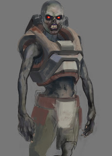
Here's the wip design for my version of the doom zombie/former human.
My general thoughts or backstory for this guy is that much in the same way that the zsec in doom3 was taken over by lost souls, so were these guys.
Their skin and body size have been drastically reduced (too look like they've been drained of any life.)
This is still very much work in progress though, but i wanted to share the design early on.

Major poop edit: i just fucking realized this looks close to rage's mutants...
Well...back to the drawing board i guess :(


Friday, January 27, 2012

Quick update before heading to bed - got to import the SU model and i've cut the model, have yet to set up UVs though too...trying to get as much of the modelling done right now.
On a side note this guy is probably gonna end up around this tris count (is that bad i wonder :S)
Either way, will try to cut it down atleast 800-1000 tris' (if i can :P)


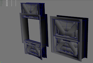
There's really no beating around the bushes - just finished the medium door...in sketchup... (original texture was called something mediocre like door2_3...meh, so long interesting names right :P.

I think its futile to try and take the whole original design 100% as it was in the classic doom game, there's no denying that the game was a mishmash of styles thrown in together (the UAC bases never really looked like 'real' space stations or whatever they were). Obviously the tech played a keen role in how the art had to be portrayed (no room on top of another mmmhh!), and with every new doom game there's been (doom 64/Doom 3/Doom II rpg) the art and style has changed.
So i'm trying to stay within the "pay tribute, but not copying 1-1 the designs" ballpark...the door designs are gonna still feel clunky, spacey but also a bit oldschool i'm hoping.


Doom door, its a wee one!

Done-so...or well not even close - here's seperated model, i didnt actually have to clean the mesh up that much after my sketchup import - tried to export via .obj which obviously resulted in one mesh, but it was far less of a hassle to detach things than check for double vertices everywhere :S.


I briefly started setting up the uv map, but i figured it'd be stupid to waste all of the extra tris' on the mesh, so i might but combine them all and cut out/connect the pieces (saves me a bunch of texture space probably too...)


Wednesday, January 25, 2012

Fuck leotards!

Mo'ar stuff for my side-project...i've been studying quite alot of doom stuff lately, being that the project here kinda requires it.
I'm confused and bewildered with Doom, atleast the classic version...its a jumbled mess of styles slammed together in a non-cohesive way almost.

Trying to remedy this by taking something like the doors and giving them a unified looks, there's going to regardless be some nods to the original classic designs, and i'm finding it really hard to come up with an iconic design for the exit door.
Yet thats probably because in my mind, the exit door for doom can't look like just any door, the original design had a taste of giger'ish in it even.

Oh well i'll trod on, on a side note too i've mocked up the entire E1M1 level ('cept for secret areas) - and i'm having a REALLY hard time not just re-imagining the different areas...breaking a promise to myself here...this all just started with me wanting a new pistol, a new imp, zombie and a few touched up textures (help me please!!!).


Variations on the floor texture in E1M1, not really happy with the old one...sheesh, looks like something outta castle wolfenstein (but i didn't want to neglect nostalgia either).


Variation of the Starg3 texture (if you dont know what that is, then i can tell you it's the very first wall texture you see in Doom)


My pistol model, still lots of work to be done, but this is a nice resolution so far, im not planning on going higher poly than this because i want to keep the close-to-low poly-look.


Thursday, January 12, 2012

Did a quick sketch for the doom pistol design, my thinking is that its pretty close the blade runner blaster - as the doom 3 one was - the classic doom pistol was hugely inspired by the Beretta 92fs pistol, but i wanted something that looks a tad chunkier.

On to the modelling soon.....ish :P


Tuesday, January 10, 2012

Bored much?

Did a logo test for remake of the original doom, using handpainted textures and 3d models....dunno why i would seriously harm my brain with a project like that :S

Tech thingy texture is from the original DooM logo done by Don Ivan Punchatz (hope i got it right).
Next up is a couple of textures and an imp+zombie+gun and shotgun...i'm only gonne try and recreate E1M1 (too big a scope otherwise....small chunks!)